Tuesday 29 September 2015
Film Noir Lighting
This scene has a typical detective interrogating somebody in a place other than a police station. The shadows are being portrayed from one light source. This means that there would be several shadows in this scene to create suspense and mystery because the audience could suggest something action packed could occur. The low key lighting used creates this because it makes the room dark because of the shadows. It's almost like somebody is waiting in the shadows to attack the detective. The corners of the room are dark which forces the audience to try and investigate the objects in the room.
Top lighting is used so their faces are clearly displayed in the scene because there is nothing to hide here. Sometimes the detective's face has a shadow on the right side of his face because the light comes from the top left side.
There aren't any filler light in this scene to utilise the shadows constructed by the light. Therefore, the effect of the film noir is still in play.
Lighting
This still image shows a female actress probably a femme fatale from a film noir. The lightings used are low key because of the shadows portrayed predominately on the left side of the image. There could potentially be back lighting from the top right side. most of her face has a shadow which suggests there is back lighting because it's not on her face.

This still image looks like a woman who is glamorous because of the top lighting. Also, it includes low key lighting to signify a women who needs a man to protect her. The image has some inference of drama and romance. The lighting doesn't really look realistic because of the darkness at the bottom of the image. Therefore, fillers have not been used to counter for the shadows because they are used for effect so wouldn't be removed.
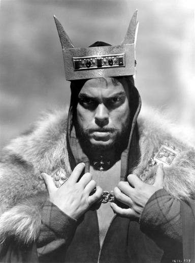
This still image shows a man who's facial expressions show aggression and power. High key lighting has been used to create realism. Back light is used to build the males structure to make him look even more powerful. Top lighting is used and I know this because of the shadows where his eyes are. This makes him seem aggressive. Filler lights are used to eliminate the shadows in the background.


This still image uses low key lighting because of the dramatic shadows on the left side of his face (key light on right side). Also, the darkness adds to the suspense because the audience doesn't know why he has a gun. In addition, top lighting is used because there is light on the character's head (right). There could be a filler light on the gun because there isn't any light further up his arm. The fact we can see the rain suggests there is a filler light in the background.
 This still image uses low key lighting because it only has one shadow on the wall (of the woman) and a mysterious shadow that the audience wouldn't know where it came from. The shadows would make an audience wonder what is scaring the character so much that she has a frightened facial expression.
This image uses high key lighting. I know this because the only light being portrayed on the characters is from the light coming through the window (most probably the sun). This means that the light is natural.


The lighting being used here is back lighting because the lights are beaming on the characters from behind. The shadows also tells an audience that the light is coming from behind them because it is in front of the characters. The silhouettes creates curiosity because the audience don't know what the characters look like.

The still image uses low key lighting because there of the shadows displayed on the right of her. This suggests the light is coming from the left side. The shadow in the background and her terrified facial expression emphasises the mysteriousness.
This still image uses high key lighting because there aren't many defined shadows especially on the wall. There is a realistic vibe in this image because it uses top lighting so there wouldn't be any shadows proportional from her head onto the wall (shadows would be below her). However, there are shadows underneath the right side of her chin which suggests the light source is coming from the top left.
Low key lighting is used to create suspense and horror. The silhouetted figure suggests the character is a sinister and devilish monster. There is light coming from the right near the character to display his face but the audience sees a person with a white mask. This adds to the mystery of the image because we don't know if the character is a murderer.
High lighting is used because I can see there are fillers being used to eliminate/reduce intensity of some shadows. The light comes from the left side because the man's arm is brighter than the woman's body. It is a little realistic because it has a film noir theme because of the man with a gun and a woman who loves him
Tuesday 22 September 2015
Film Poster Analysis

Blade Runner
This movie looks like its about a war in space. I can suggest this because of the futuristic looking gun he is holding and the unusual buildings in the bottom or perhaps they are spaceships. The quote in the top right hand corner says, ' Man has made his match... Now it's his problem'. This implies the humans in this film have constructed something as powerful as their selves. This film will most probably be about the humans trying to kill the child they have created. The genre is sci-fi because of the futuristic props on the poster (gun, spaceship). I think the target audience is 70% males and 18-35 years of age. People who are very imaginative would enjoy this film because of the fiction.

Scary Movie 2
This movie poster suggests the movie will be about teenagers meeting up somewhere (house- friends) and experience scary events. Despite this, there are some things on the poster that infers that will involve some humour. For example, the women on the left has on her top 'I love dead people' which implies the producer of the poster wants the audience to feel curious about the film. Also, one could infer that this film could be a parody of horror films because some facial expressions look as if they are joking or not really scared. Normally on horror posters, the characters would look scared. The genre is comedy and horror. I think the target audience if 15-35 years of age. This is because these people would be able to relate to the characters and imagine themselves with their friends in a scary situation.
UZAK
This movie poster looks to be about a man who is lost. The area looks deserted but the man could possibly be returning to his home. I think the genre is drama. The target audience is 28-40 years of age because people around those ages could possibly relate to him. The quotes on the side describe something different the background.

I'm not scared
This movie looks to be about a boy who finds a whole and wants to find out what's its doing there. The sunny sky in the background could suggest this movie is a happy one. Therefore, I think the genre is a thriller because he could potentially find something fascinating. The target audience is 16- 30 years of age. The teenager could suggest this movie is a thriller because he could discover something dangerous.

Sin City
This movie looks to be about people fighting and killing to possibly protect the silhouetted female figure. The colours used are dark and monochrome which suggests death and crime. the genre for this movie could be crime because of the gun and knife. The target audience could be for 16-35 years; perhaps 65% males.

Pirates of the Caribbean
This movie looks to be about a pirate who could be trying to save the lady. I can suggest this because of the gun he is holding. The colours are dull probably because of the waves they are going top face on their journey and the other pirates they would come up against. The other two could be the ones the pirate is trying to help. The genre for this is action because of the viscous waves they could face and the gun he is holding suggests this. The target audience is 12-40 years of age.

Bride and Prejudice
This movie looks to about a marriage that could possibly be held up but will eventually take place. I can suggest this because of the colours (happiness) and the character's facial expressions. The genre could be comedy which probably is related to one culture. Therefore I think the target audience is of the Asian culture for 25-60 years of age.

Million Dollar Baby
This movie poster looks to be about a female who can fight for herself to protect herself from any enemies. The man on the left of her looks to be a villain who wants to take her down, The colours used imply the genre is thriller and action because the it signifies death. I think the target audience is 50-50 male/female because it includes a possible women main character. the ages could be 16-35 years of age.
Subscribe to:
Posts (Atom)